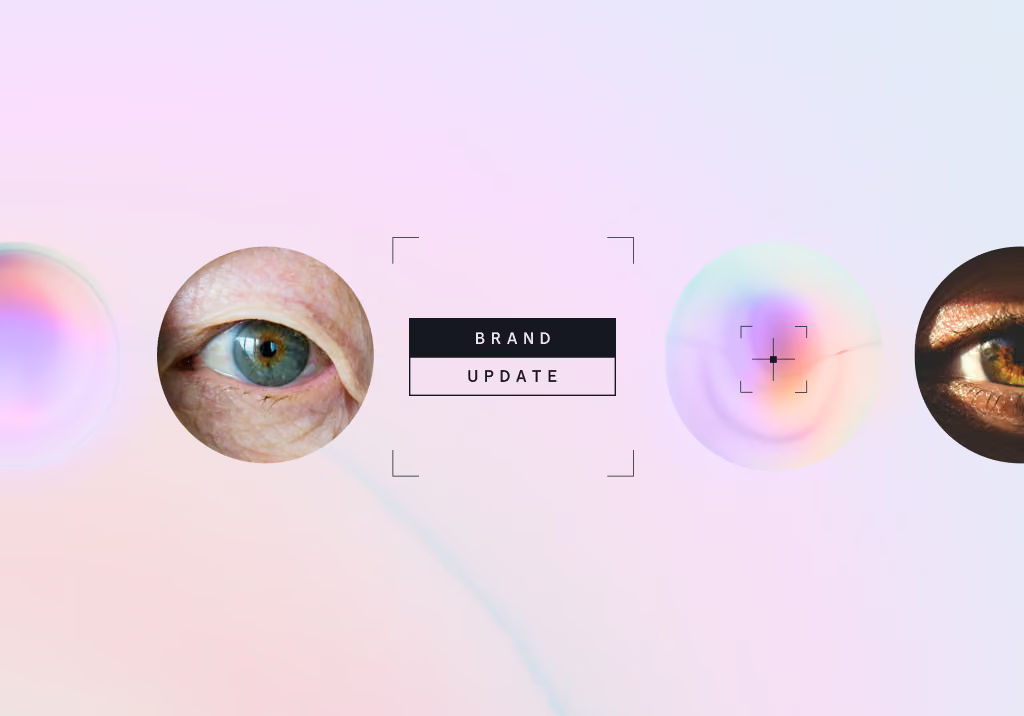
Illuminating the intersection of medical AI and human-centered care.
Healthcare is entering an era where every second, every scan, and every data point counts. As Eyenuk continues to expand its global reach and scale autonomous AI diagnostic solutions across health systems, we are excited to unveil our refreshed brand identity. Developed in partnership with design agency PACT Studio, this evolution marks a major milestone in how we communicate our technology, our mission, and our impact.
Why we refreshed our brand
Over nearly two decades of clinical experience and innovation, Eyenuk has grown from a pioneer in diabetic retinopathy screening into a comprehensive global platform advancing systemic health through retinal AI.
While our underlying commitment to clinical validation has not wavered, our expanded capabilities required a modern visual and verbal identity. Traditional medical software branding often feels cold, overly technical, or detached from patient care. We set out to build a brand language that bridges technical precision with human empathy. We wanted to blend our sophisticated AI under the hood with the human lives we impact with early detection, and feel that this refreshed identity brings our tech closer to the patient.
Founded on core beliefs
Our refreshed brand strategy articulates the core principles that guide every product development and clinical decision we make.
- Early intervention transforms outcomes. Detecting disease in its earliest stages enables proactive intervention, helping prevent irreversible vision loss and long-term health complications
- Trust through validation. In medical AI, speed alone is not enough. In fact, it can be dangerous. True innovation requires rigorous clinical validation, regulatory transparency, and unwavering diagnostic accuracy
- Sustainable healthcare economics. Effective preventative programs must lower long-term costs for health systems while seamlessly fitting into existing clinical workflows
- Equitable access to care. Healthcare access should be universal. Geography, income, and local infrastructure should never dictate a patient's health outcomes
How we stand out
Designed to bridge high-tech artificial intelligence with patient care, our new visual language brings clarity, warmth, and precision to every touchpoint.
- A purposeful new logo. Our updated logo combines clean typography with a redesigned logomark representing optical focus and scanning technology
- Color palette. Our primary colors are inspired by retinal diagnostic heatmaps, blending soft, warm tones with grounding dark accents to keep our brand human and approachable
- Dual brand experience. To communicate effectively with different audiences, our identity features two distinct modes. Light Mode highlights authentic human portraiture and patient care, while Dark Mode provides a clean backdrop for technical, clinical, and scientific data
- Camera-inspired graphics. Drawing from optical camera UI, subtle viewfinder frames, focus grids, and scan indicators deliberately bring diagnostic precision into focus throughout our graphics and distributed materials
- Updated fonts. Clean, modern typography ensures complex diagnostic metrics and clinical reports remain effortlessly legible for healthcare providers
Looking ahead
A brand refresh is more than a new look. It is a renewal of our promise to healthcare providers and patients worldwide. As we continue rollout across our software platforms and digital presence, our new identity serves as a constant reminder that behind every retinal scan is a person worth looking out for.